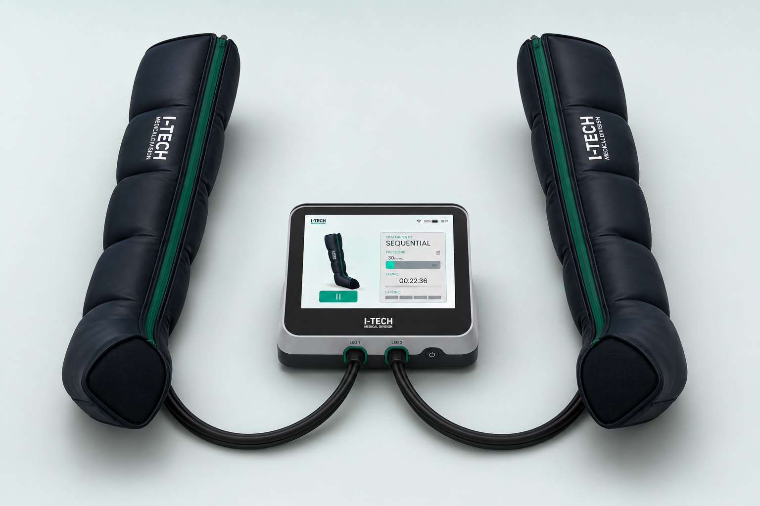
Pressotherapy display · Medical device
I-Tech
One compact touch screen for a pressotherapy device that patients and practitioners can use without help.
At a glance
- +32%patients using the device correctly
- −35%setup time, from about 6 minutes
- 47patients in usability tests
Challenge
A bulky unit with a dated, low-quality screen. Patients misused it, practitioners needed about 6 minutes per setup.
Approach
Usability tests with 47 patients, then one 480 × 320 display built for clinical precision and first-time use, to IEC 62366.
Result
+32% correct use by patients, setup 35% faster for practitioners.
The problem
Pressotherapy is a powerful recovery tool, but the previous I-Tech unit was stuck in the past: bulky hardware, a large low-quality screen and dated colours and design.
Patients at home and practitioners running several treatments at once both struggled with it, for opposite reasons.
Who uses it · two contexts, one screen
Run several treatments at once and need clinical precision, fast setup and a quick read from across the room.
- Exact pressure in mmHg
- Six treatment programs
- Setup in seconds
Often use the device alone, the first time without guidance, and need to feel they cannot get it wrong.
- One clear action at a time
- See what the device is doing
- Clear warnings, plain words
A bulky unit with a large, low-quality screen and dated colours and design.
My role
Role
UX/UI Designer
I worked embedded with engineers and developers to redesign the interface from scratch: not a cosmetic refresh, but a rethink of how people use the device.
Worked with
- Engineers
- Developers
What I owned
- 01UX/UI audit
- 02Usability testing
- 03Interaction model
- 04Touch UI design
- 05Engineering hand-off
How I approached it
Research revealed two needs that had to live in one interface: precision for clinical protocols and simplicity for first-time, unsupported use. All of it on a 480 × 320 display and, as a medical device, in line with IEC 62366, the usability engineering standard.
Key decisions
- 01One unified screen to set, monitor and controlReplaces a fragmented hardware panel.
- 02The leg is the feedbackInflating chambers light up, so users see and trust what happens.
- 03Pressure colours mean the same thing everywhereOne colour per range, on the leg and on the bar.
- 04Progressive disclosure for clinical parametersPrecision for experts, calm for first-timers.
- 05Checked against IEC 62366Colours, contrast and warnings follow the medical usability standard.
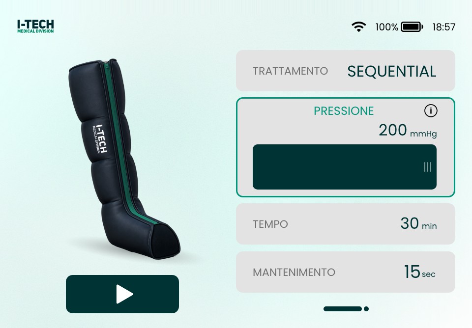
Six programs, one visual language
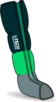
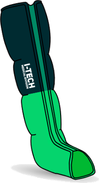
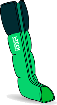
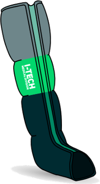
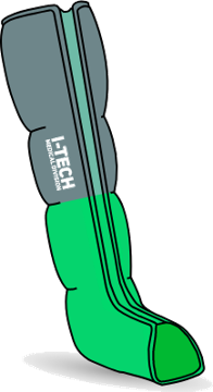
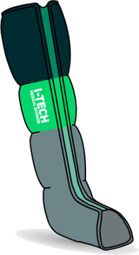
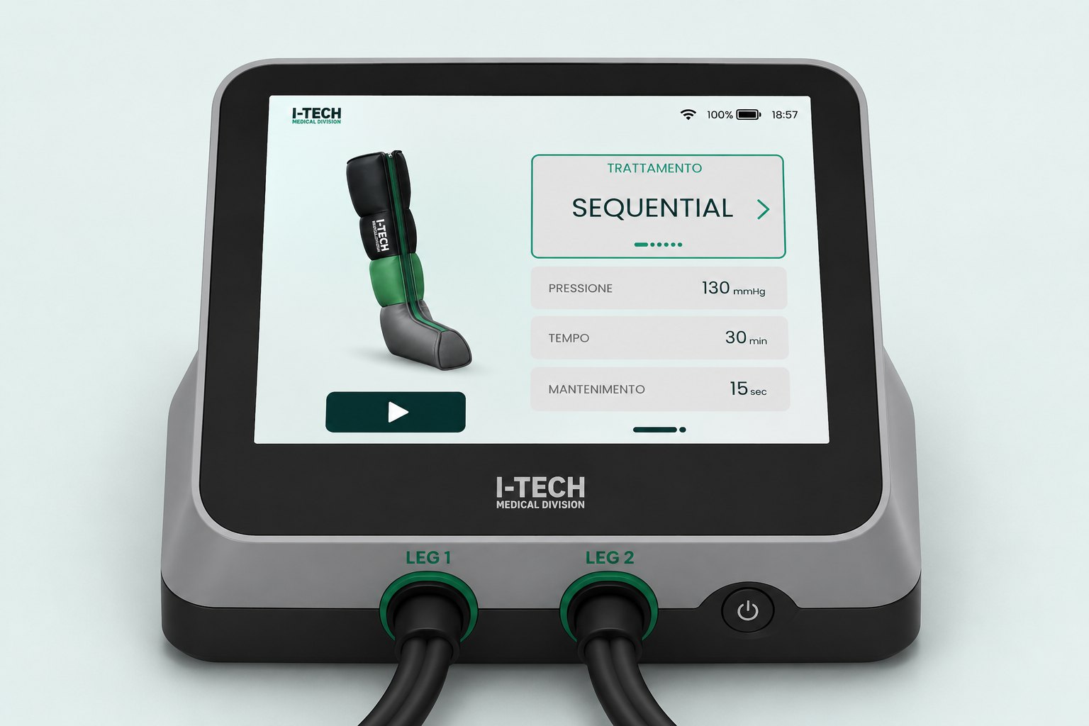
Each program is drawn on the leg itself: the chambers that inflate take the colour of their pressure level, so the screen shows what the cuff is doing.
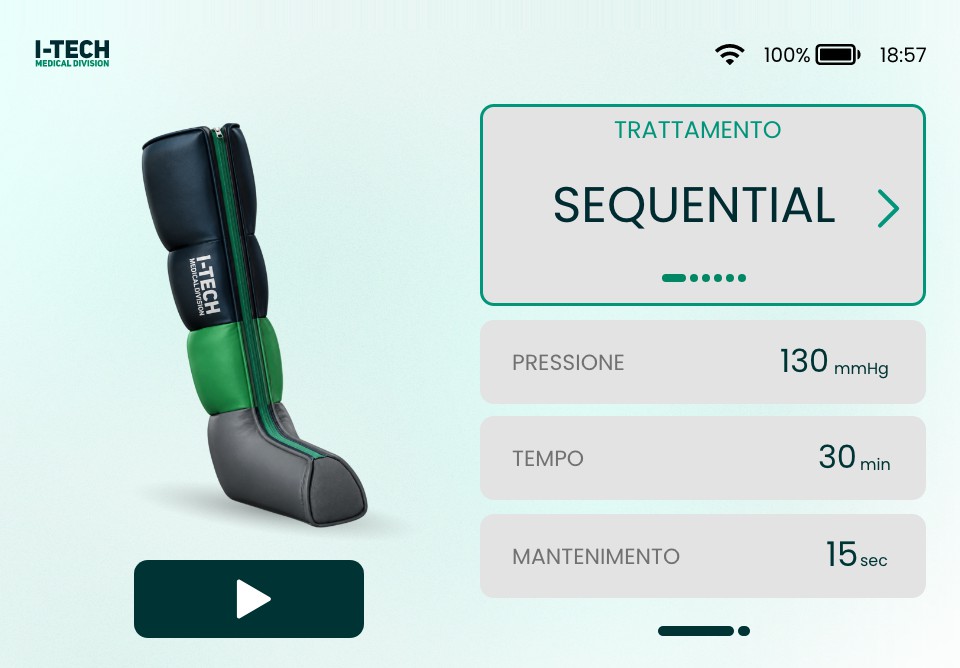 12345
12345- 1Six programs in one card; the dots show where you are
- 2Pressure in mmHg, the clinical unit
- 3Session length
- 4Hold time between cycles
- 5Start, the only dark button on screen
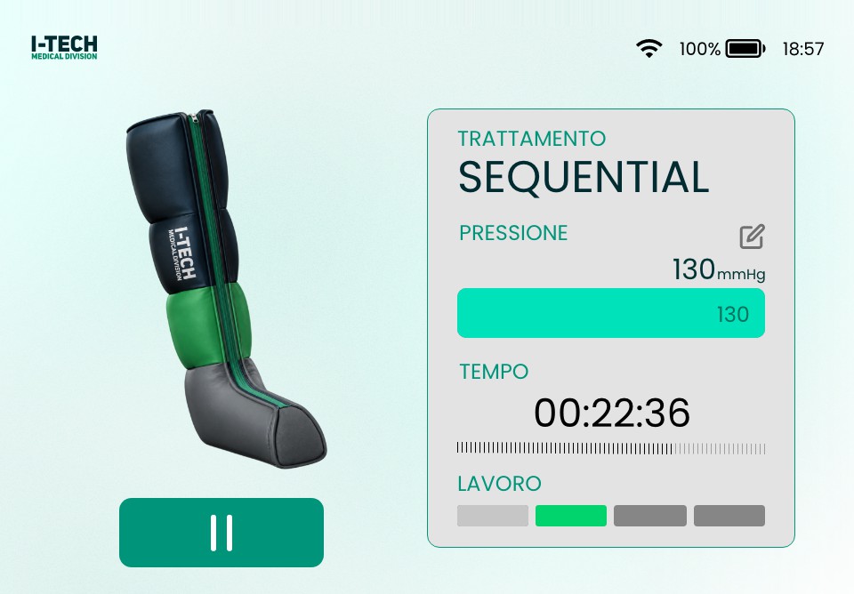 12345
12345- 1The chamber inflating right now lights up on the leg
- 2Pressure bar in the colour of its level
- 3Time left, always on screen
- 4Which phase of the cycle is running
- 5One large pause, reachable without looking
What I built
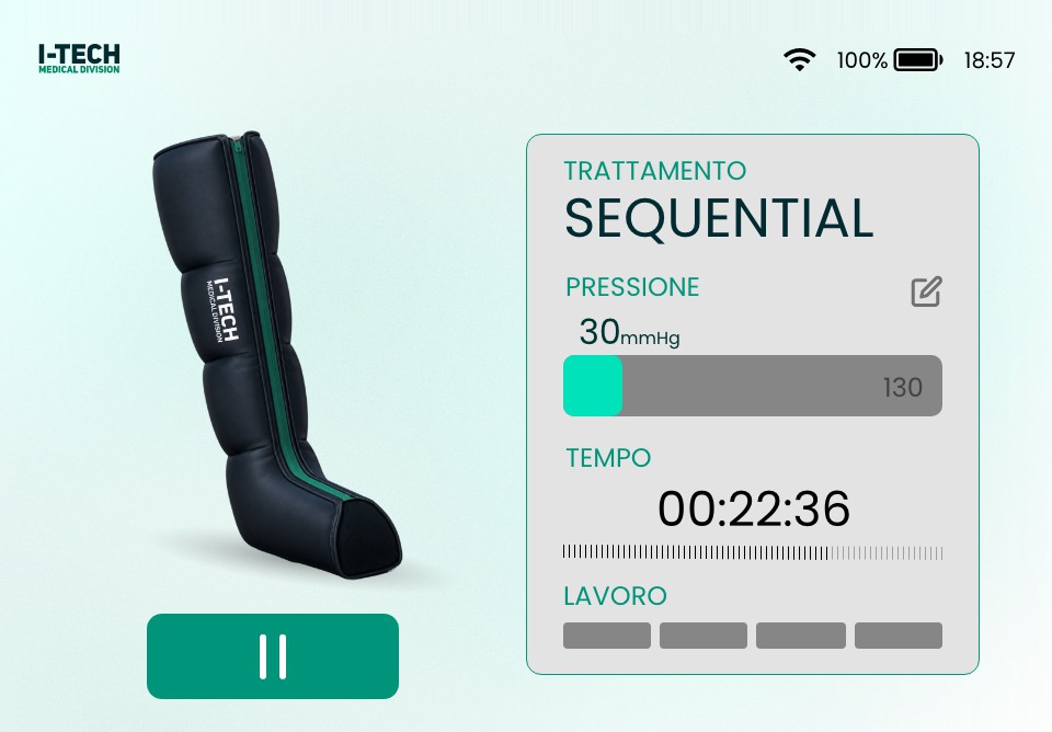
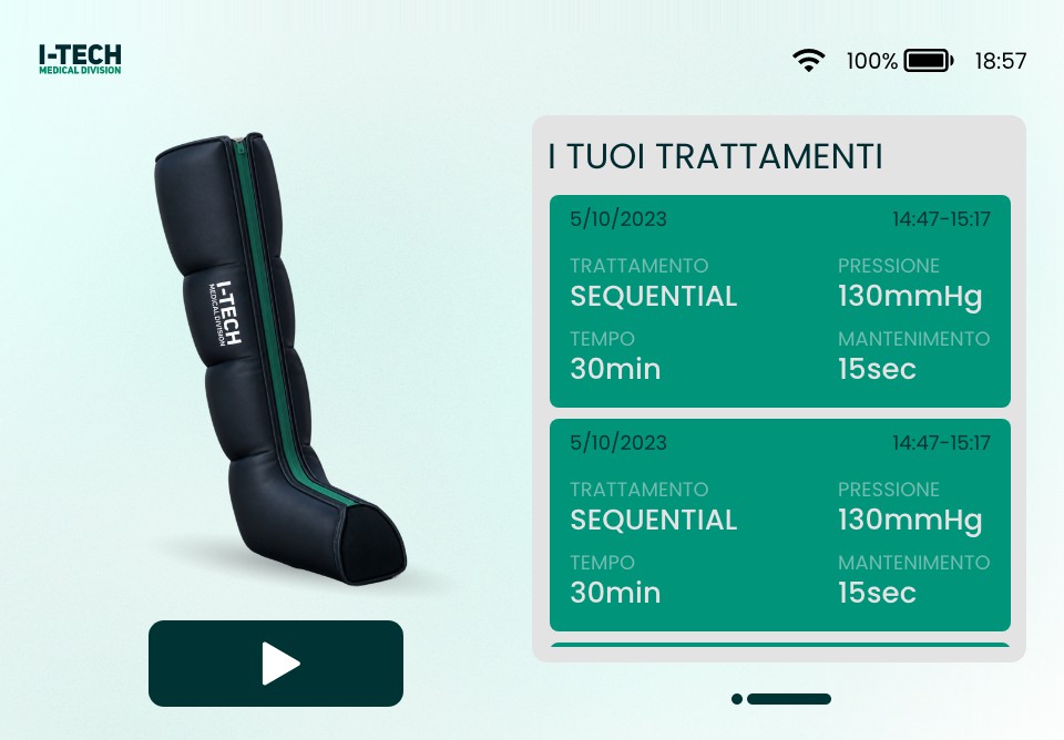
A compact unit where the cuffs, the on-screen controls and the visual feedback work as one medical-tech product.
- Six treatment programs
- Pressure in mmHg
- Live chamber feedback
- Pause and resume
- Safety warnings
- Session history
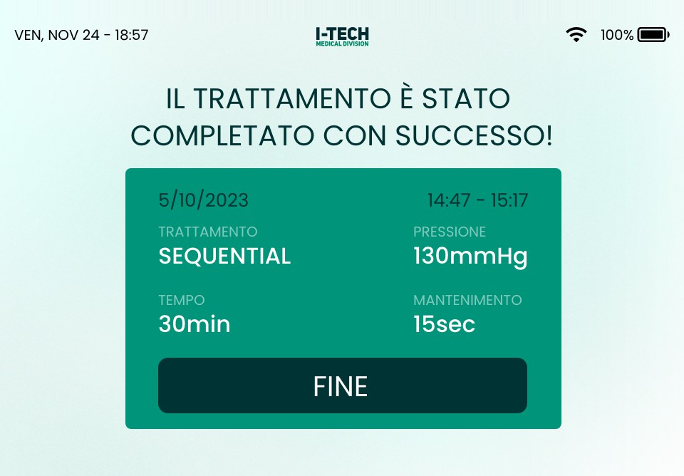
Type · Poppins · sizes at 1x on the 480 × 320 display
Color
Pressure levels
Alarms · IEC 62366 use-error controls
Stops the session
Pauses, asks to check
Tells, never blocks
- Never colour alone: every alarm pairs an icon, a word and a colour
- Warning triangle after ISO 7010 W001, read the same way everywhere
- Text contrast at least 4.5:1 on the display
- One explicit action to dismiss, so nothing is acknowledged by accident



The result
- +32%patients using the device correctly
- −35%setup time, from about 6 minutes
- 47patients in usability tests
In usability tests with 47 patients, correct use, from connecting the boots to choosing and handling the treatment, rose by 32% against the previous unit. Practitioners set up a session 35% faster, from about 6 minutes to under 4, so clinics fit more treatments per day on the same hardware.
Usability tests · previous I-Tech unit vs the redesign
Patients using the device correctly
From connecting the boots to choosing and handling the treatment
Setup time per session, practitioners
From power-on to a treatment running
47 patients for correct use; practitioners for setup time.
The previous unit: bigger hardware and screen, low-quality display, dated colours and design.
Designed and checked against IEC 62366, usability engineering for medical devices.