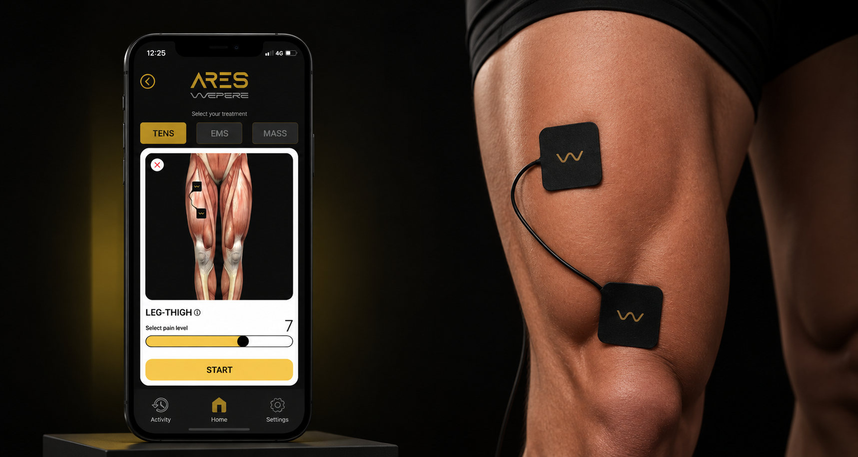
Medical device · iOS & Android
Ares
Making professional electrotherapy usable by anyone, regardless of age or technical confidence.
At a glance
- −47%setup time, from about 5 minutes
- 5screens from pairing to an active session
Challenge
Electrostimulation is intimidating: for older, less technical users the interface itself blocks the treatment.
Approach
A guided, step-by-step flow with anatomical visuals instead of a control panel.
Result
Setup about 47% faster, from roughly 5 minutes in usability tests.
The problem
Electrostimulation is clinically effective for muscle recovery, but the devices that control it are complex and intimidating. For older adults and less technical users, the interface itself becomes the barrier to treatment, which means the therapy never delivers its benefit.
Who it was for: not tech-savvy early adopters, but people who needed the therapy to work without first learning the tool, in clinical and home settings. The professional uses the device first, in the clinic, then gives it to the patient to continue the therapy at home, alone.
In usability tests on the product before the redesign, setting up a session took about 5 minutes.
Desk research · why guidance matters
Takeaway: the people who need pain relief most are the least supported by today's devices.
Competitive analysis · feature coverage
| Hardware remote | Generic TENS app | Ares | |
|---|---|---|---|
| Visual electrode placement | – | – | ● |
| Tap the body to pick an area | – | – | ● |
| Pain level drives the program | – | ● | ● |
| One decision per screen | – | – | ● |
| Large, high-contrast controls | ● | – | ● |
| Session timer & history | – | ● | ● |
User needs · from interviews & observation
Know exactly where the pads go, without reading a manual
Start a session in a few taps and never feel stuck
Trust that protocols at home match what was prescribed
My role
Role
Lead UX/UI Designer
Lead UX/UI designer, embedded with engineers, researchers and developers from concept to delivery.
Worked with
- Engineers
- Researchers
- Developers
What I owned
- 01Journey mapping
- 02Interaction model
- 03UI for iOS & Android
- 04Usability testing
How I approached it
The central tension was precision versus simplicity. Professional protocols need precise parameters; non-technical users need to feel they cannot get it wrong. I mapped the user journey across clinical and home contexts, found where complexity could be abstracted away, and replaced a control panel with a guided, step-by-step model.
Designing for safety: in a medical product, a wrong setting is a safety issue, not an annoyance. The guided flow walks the user through each step in order, so there is one clear action at a time. Because Ares is classified as a medical device, colors, shapes, hierarchy and contrast were analysed against IEC 62366, the usability engineering standard for medical devices.
Testing: I validated the design with usability tests on older and non-technical users.
Key decisions
- 01Every device control on one screenIntensity, pause, stop and mode always in reach, nothing behind menus.
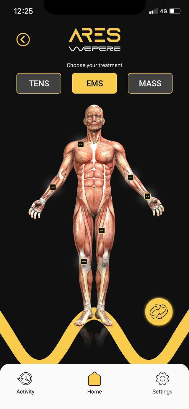
- 02Body zones first, then placement and intensityWhere electrodes go first, then how to place them and set the intensity.
- 03Technical detail removed or reducedParameters users don't need were cut, within what regulations require.
- 04Colors, shapes, hierarchy and contrast checked against IEC 62366Every visual choice checked for usability and safety.
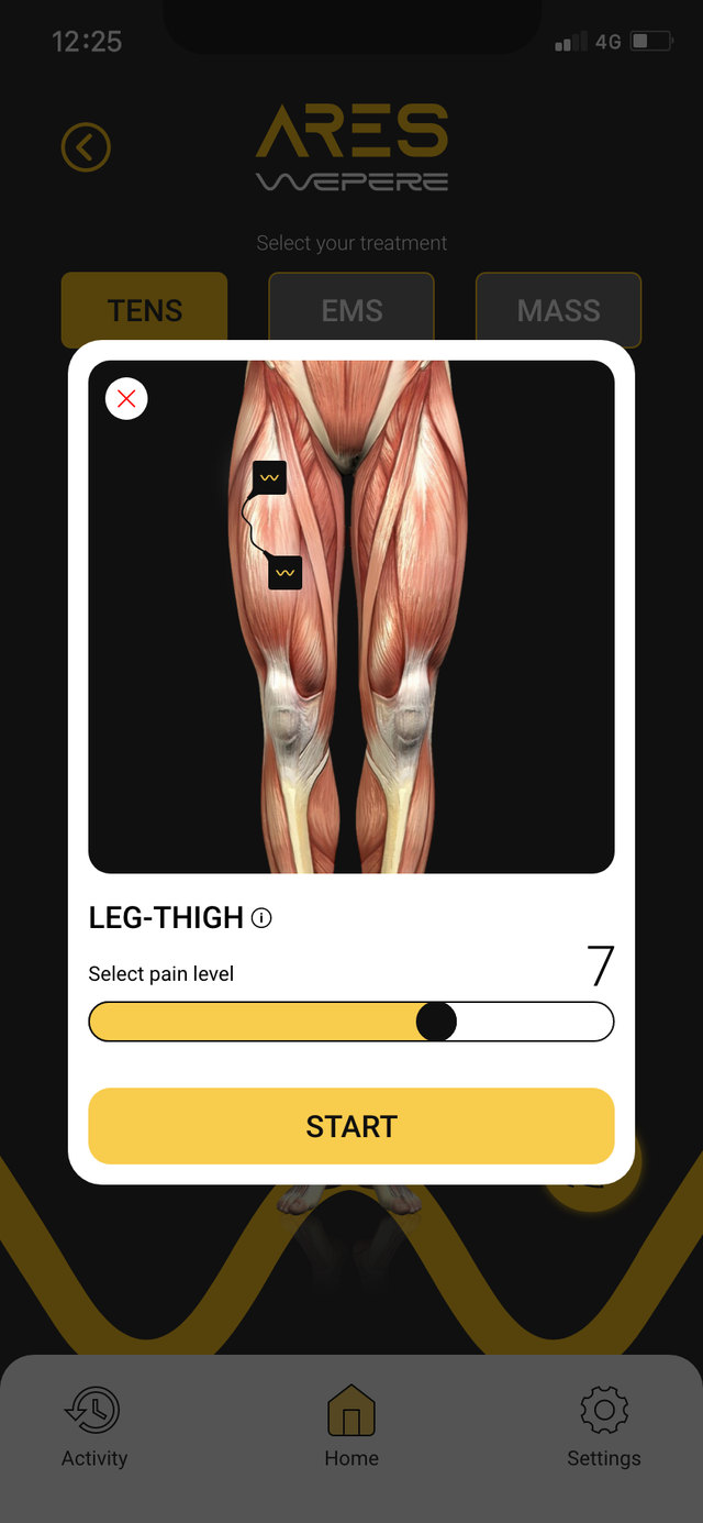 123
123- 1Anatomical view shows exactly where each electrode goes
- 2Pain level in one slider, no medical jargon
- 3A single, large action to start
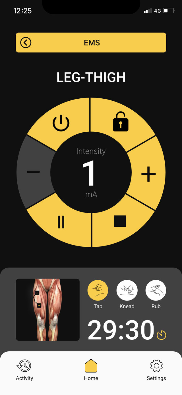 123
123- 1Intensity in the centre, readable at arm's length
- 2Every control on one dial, sized for thumbs
- 3Timer always visible, so a session is never left half-done
What I built
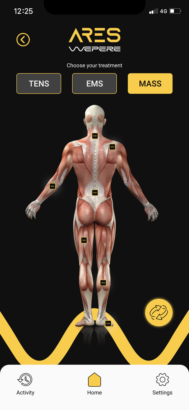
Anatomical visuals show where to place electrodes, the real hardware appears in the flow, and the app controls sit beside them, so the interface matches what the user holds in their hands. Designed in Figma.
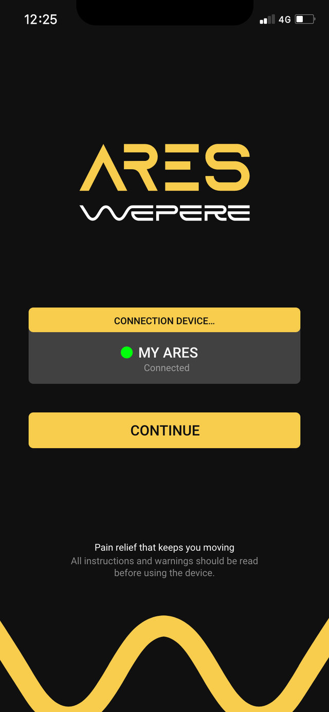
- Device pairing
- Anatomical body map, front and back
- Electrode placement guide
- Pain-level driven programs
- Session dial: intensity, pause, stop
- TENS, EMS and massage modes
Type · Roboto · sizes in pt on the 414 × 896 screen
Color
Components
Electrode pad
Safety · IEC 62366
The result
- −47%setup time, from about 5 minutes
- 5screens from pairing to an active session
Before the redesign, setting up a session took about 5 minutes in usability tests. After the redesign, setup time dropped by about 47% among older and non-technical users, and a working prototype let us test the interaction with real users.
Usability tests · before vs after the redesign
Same tasks before and after: pairing, placing electrodes, choosing a program and starting a session.